Logo Design
Client: Superior Elite Training Method, 2024
https://www.sarahthomasonpilates.com
Sarah Thomason is a highly-skilled, multi-dimensional Pilates and dance instructor in Los Angeles who developed her own exclusive teacher training course for Pilates. The Superior Elite Training Method is anatomy-based and focuses on the foundations Joseph Pilates invented while also incorporating physical therapy and modern advancements to give SET graduates comprehensive and highly-adaptive knowledge to be able to teach any client coming to learn Pilates. Using this information, as well as descriptive words from Sarah such as “longevity, vibrant, integrity of movement,” I came up with logo designs to fit the uniqueness of this program. Sarah and I collaborated to find a balance between fun and professional, sophisticated but approachable, all-the-while celebrating the human body and what it can accomplish. Sarah ended up loving multiple designs and adopted four separate logos for each of her teaching modules: Mat, Cadillac, Chair, and Reformer.
Client: The Running W Farm, 2021
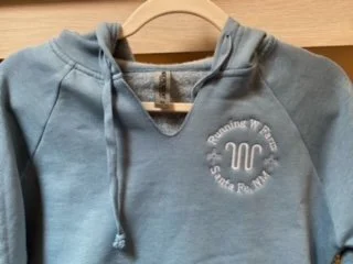
Paying homage to my hometown, I was asked to create a logo for a new ranching business operating in Santa Fe, New Mexico. The criteria were: use the iron brand pattern already in use by the farm, create a logo that could easily be embroidered on merchandise as well as company products, and to have an option in a very specific color, “Santa Fe blue.” It was a fun project and progressed quickly with such clear inspiration.
Client: Black Dog Press, 2019
Located in Boulder, Colorado, Black Dog Press is a boutique letterpress and design studio operated by Carolyn Sweeney. Not only is she a letterpress master who does all kinds of projects from wedding invitations to stationery, she teaches classes in printing techniques, demonstrating on her own 100-year-old platen press. We had a goal of blending a traditional sketchy look with modern sleek design, having the logo be charming but cool and professional. We went through several design iterations to reach our little pup, and we love him very much!
Client: Hadley New York, 2017
I had the opportunity to collaborate with a female entrepreneur who was starting a designer clothing brand for tailor-made women’s dresses. I learned the history behind her company name “Hadley” and we both agreed the brand needed to be chic, sophisticated, feminine, and modern. I went through several ideas, including the dress form creating the letter “H” (seen below), before the idea of the corsage pin struck me. Suddenly, we were cooking with gas! The pin (or sewing needle, depending on how you saw it) became the ubiquitous symbol for the brand, offering a hint of what the brand meant while also being subtle.


